Pantone Color of the Year 2024

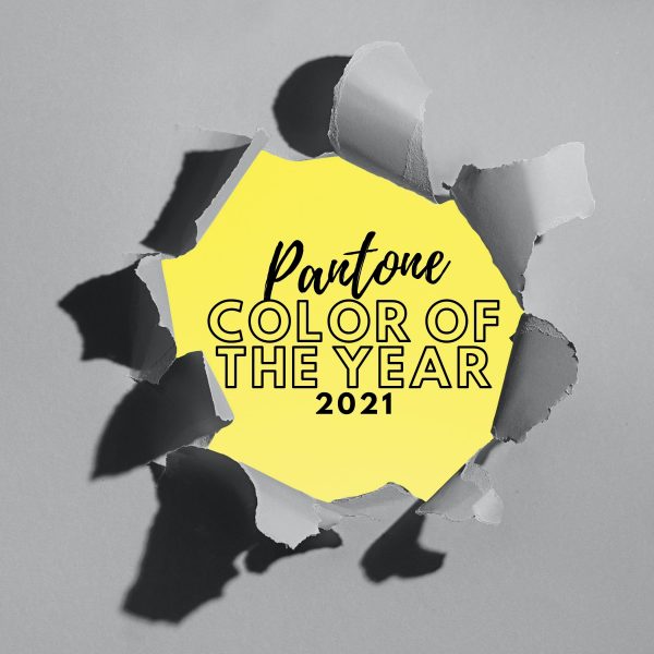
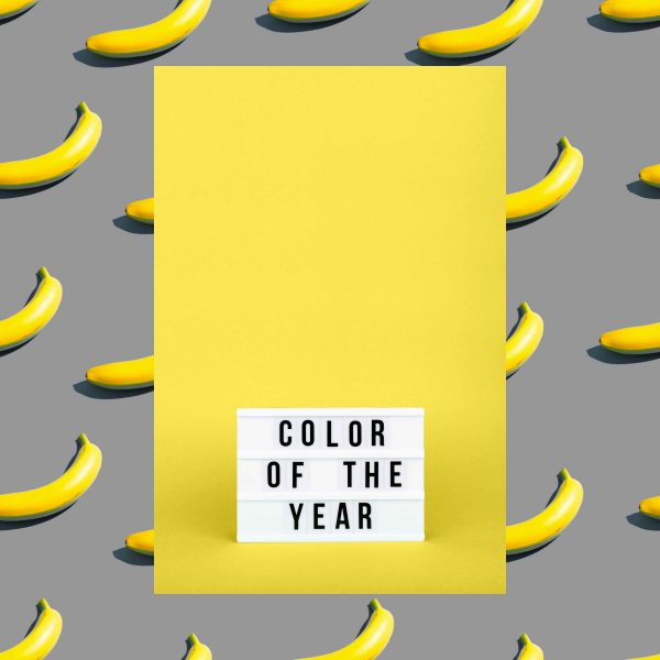
Not quite pink, not quite orange; Pantone’s color of the year has been announced for 2024. The gentle hue — «whose all-embracing spirit enriches mind, body, and soul,» according to a statement by the company — is officially named PANTONE 13-1023 Peach Fuzz.

Subtly sensual, this beautiful shade is a heartfelt peach hue bringing a feeling of kindness and tenderness, communicating a message of caring and sharing, community and collaboration. A warm and cozy color highlighting our desire for togetherness with others or for enjoying a moment of stillness and the feeling of sanctuary this creates, PANTONE 13-1023 Peach Fuzz presents a fresh approach to a new softness. Capturing our desire to nurture ourselves and others, it inspires belonging, recalibration, and finding peace from within, impacting our wellbeing. An idea as much as a feeling, PANTONE 13-1023 Peach Fuzz awakens our senses to the comforting presence of tactility and cocooned warmth. Sensitive but sweet and airy, PANTONE 13-1023 Peach Fuzz evokes a new modernity.

Why Was Peach Fuzz 13-1023 selected to be the Pantone Color of the Year 2024?

At a time of turmoil in many aspects of our lives, our need for nurturing, empathy and compassion grows ever stronger as does our imaginings of a more peaceful future. We are reminded that a vital part of living a full life is having the good health, stamina, and strength to enjoy it. That in a world which often emphasizes productivity and external achievements, it is critical we recognize the importance of fostering our inner selves and find moments of respite, creativity, and human connection amid the hustle and bustle of modern life.

The Pantone Color of the Year 2024 expresses the desire to want to be close to those we love and the joy we get when allowing ourselves to tune into who we are and just savor a moment of quiet time alone. Its gentle lightness and airy presence lifts us into the future.

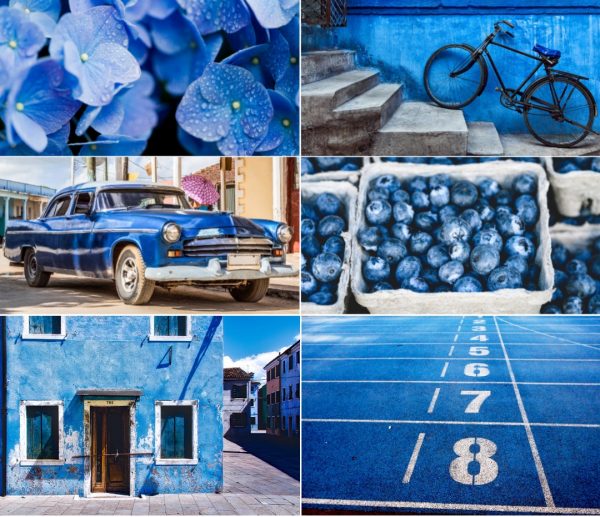
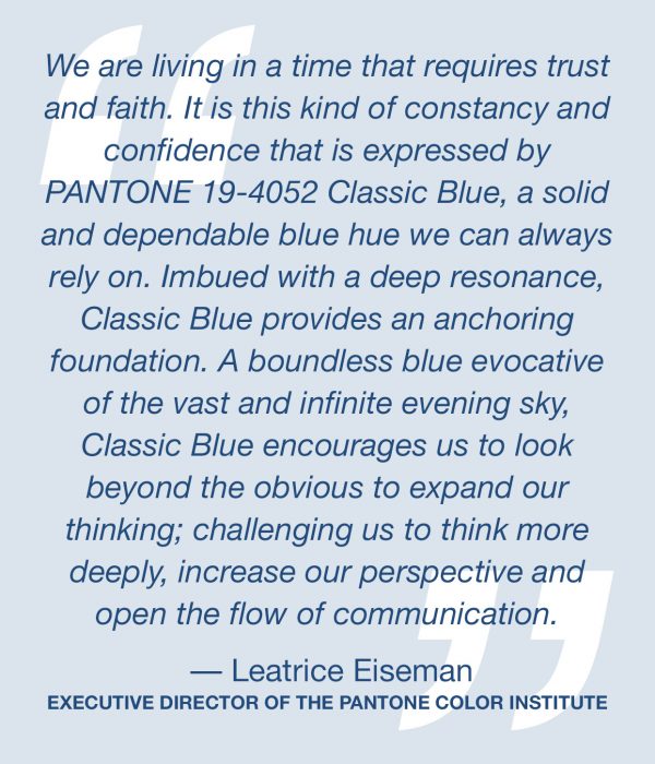
«In seeking a hue that echoes our innate yearning for closeness and connection, we chose a color radiant with warmth and modern elegance. A shade that resonates with compassion, offers a tactile embrace, and effortlessly bridges the youthful with the timeless
Leatrice Eiseman – Executive Director, Pantone Color Institute™

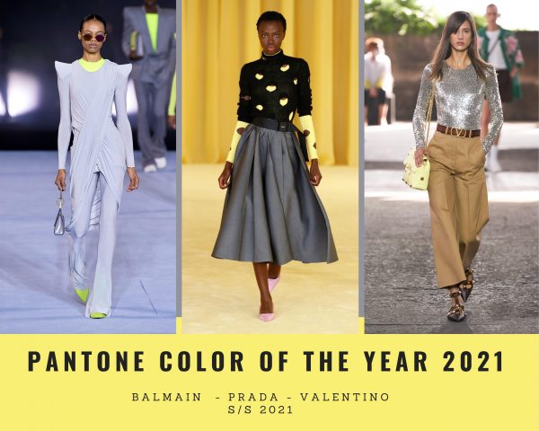
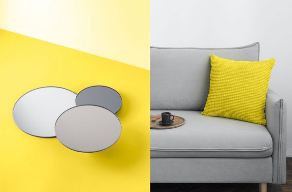
PANTONE 13-1023 Peach Fuzz in Apparel and Accessories

Visually arresting and inviting, PANTONE 13-1023 Peach Fuzz is a nurturing peach tone that inspires us to instinctively want to reach out and touch. Conveying a message of tactility that comes through in sueded, velvety, quilted, and furry textures, luxuriously soothing and soft to the touch, PANTONE 13-1023 Peach Fuzz is an enveloping peach hue that awakens our senses to the comforting presence of tactility and cocooned warmth.

LoL, Sandra

Photos: Courtesy of the Brands
DISCLOSURE: We may earn commission from links on this page, but I only recommend products I love. Promise.

Pantone Color of the Year 2023

Welcome to the Magentaverse! The world’s color authority has spoken, and this year, the smoke that wafted up from the Pantone conclave was tinged a deep, pinkish red: All hail Viva Magenta, Pantone’s 2023 color of the year.

What is Viva Magenta?

Pantone’s Color of the Year, Viva Magenta 18-1750, vibrates with vim and vigor. It is a shade rooted in nature descending from the red family and expressive of a new signal of strength. Viva Magenta is brave and fearless, and a pulsating color whose exuberance promotes a joyous and optimistic celebration, writing a new narrative.

This year’s Color of the Year is powerful and empowering. It is a new animated red that revels in pure joy, encouraging experimentation and self-expression without restraint, an electrifying, and a boundaryless shade that is manifesting as a stand-out statement. PANTONE 18-1750 Viva Magenta welcomes anyone and everyone with the same verve for life and rebellious spirit. It is a color that is audacious, full of wit and inclusive of all.

«In this age of technology, we look to draw inspiration from nature and what is real. PANTONE 18-1750 Viva Magenta descends from the red family, and is inspired by the red of cochineal, one of the most precious dyes belonging to the natural dye family as well as one of the strongest and brightest the world has known.

Rooted in the primordial, PANTONE 18-1750 Viva Magenta reconnects us to original matter. Invoking the forces of nature, PANTONE 18-1750 Viva Magenta galvanizes our spirit, helping us to build our inner strength

Leatrice Eiseman
Executive Director, Pantone Color Institute

While the color has deep connections to both the past and the present, the institute wants to be clear that it’s also a color that’s undeniably fitting for the present, a shade that encourages all people to live life boldly in the moment. I like the message behind that shade that is in between red and blue. Let’s dig into the Magentaverse…

LoL, Sandra

Photos: Courtesy of the Brands
DISCLOSURE: We may earn commission from links on this page, but I only recommend products I love. Promise.

Valentino PP Pink Collection

Before showing you the details of one of my favorite outfits for F/W 2022, I would like to take you to the moment when it all started. In March 2022, I attended the Valentino F/W 2022 presentation. The invite, created with artist and writer Douglas Coupland, was beautifully done in pink and my gut feeling told me to wear something in this color family.

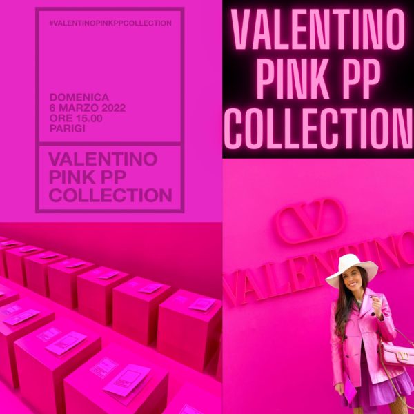
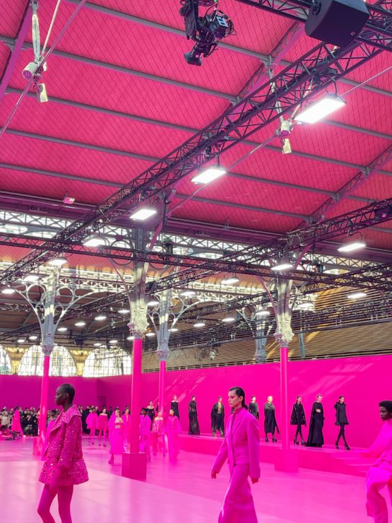
Beautiful show invitation and surprises from Valentino

The moment I entered the show location at Carreau du Temple in Paris, I perfectly blended in. The hall was decorated in all pink – giving the audience a hint of what would be coming up. However, I think nobody would have expected the full spectrum.

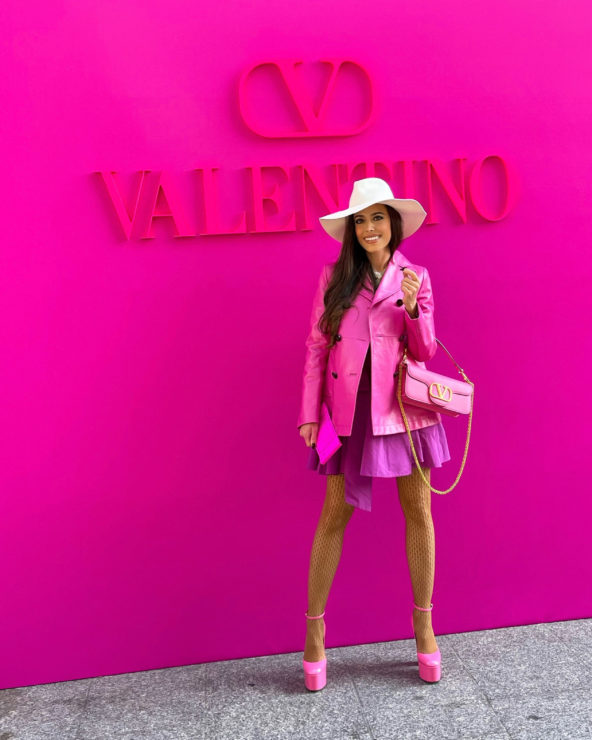
Details of my look coming up shortly… it’s all Valentino from different seasons.

For Valentino‘s F/W 2022 collection, Pierpaolo Piccioli focused on a single color, hot pink. A shade, developed in collaboration with Pantone, and exclusive to Valentino, so catchy and energetic that it deserves its own name, Valentino Pink PP. Right before the show started, Zendaya, the Maison’s muse, arrived in a pink power suit with floral appliqués from the new collection. The American star is also the face of the Valentino Pink PP Collection campaign.

For the designer, «it was a monochromatic journey into the realm of possibilityEvery look on his runway was pink or it was black. Needless to stay, the vibrant fuchsia tone stole the show. The Pink PP collection emphasized textures, materials, and precious items details.

Radical. Monochromatic. Beautiful. Valentino’s La vie en rose presented couture and oversized silhouettes created with interesting materials, from silk faille, to silky wool, to feather embellishments Piccoli is known for. Jumpsuits with graphic necklines, cargo trousers, transparent blouses, knitwear made with sequins, 3D floral embellishments, cut-out bustiers, and spectacular dresses encrusted with crystals, flowers and/or bows. The looks were completed by full-length tights in the respective color and vertiginous platforms, that gave the impression of ultra long legs. Something we all want.

Thus Valentino moved from the signature red to pink and that translated also into the labels and shopping bags this season. The collection has been ultra successful so far, selling out like crazy.

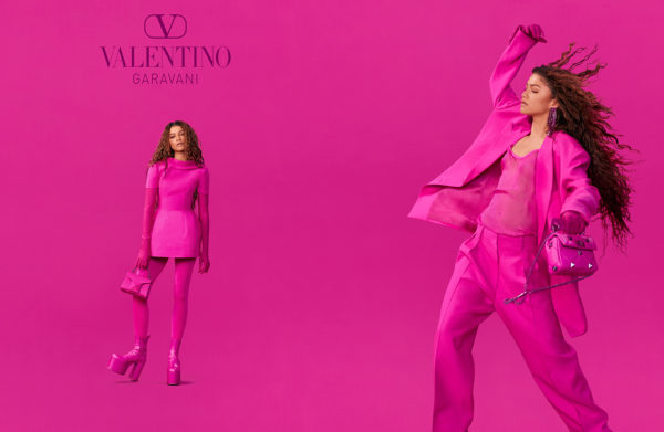
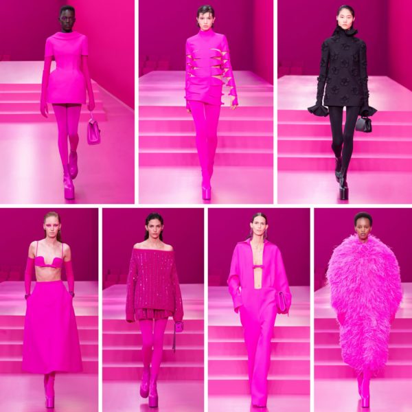
My favorite dress from the collection. It was love at first sight when I saw it on the runway (left) and the next day in the showroom(right).

When you buy a Valentino Pink PP piece, each item will be accompanied by a Certificate of Authenticity (available only for pink items) to celebrate its unique identity.

Pink PP charisma takes the globe. The Maison celebrates the new Valentino Pink PP collection, making its mark with installations in cities around the world. I shot my first look (yep, I got many… this collection is too good!) in front of the store at 27 Rue du Faubourg Saint-Honoré in Paris, that was wrapped all in pink during Paris Fashion Week.

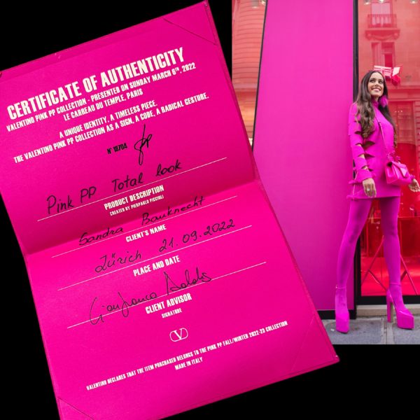
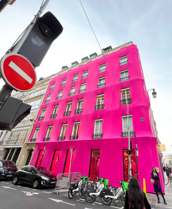
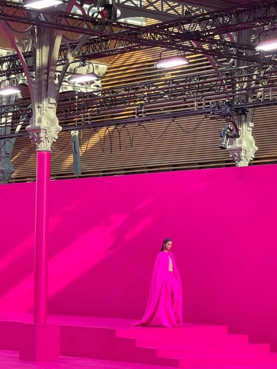
Landed in pink paradise when I visited the showroom the next day to see everything close up.

Below you can see more impressions from the show, my showroom visit and some of the celebrities who attended the runway show.

LoL, Sandra

American actress Vanessa Hudgens (High School Musical )

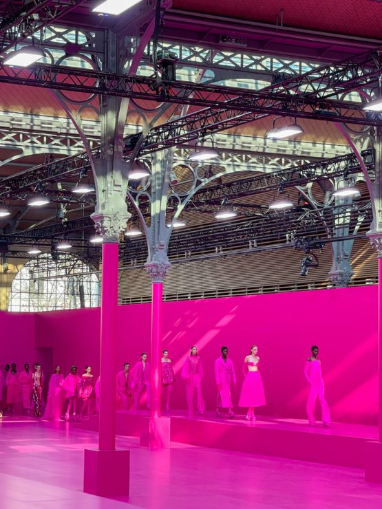
Gilda Ambrosio (The Attico – a brand I love)

My lovely host Libby Page, Market Director at NET-A-PORTER

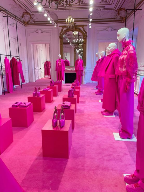
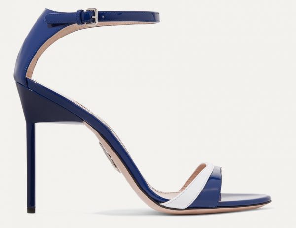
Obsessed with these heels!

Photos: © Sandra Bauknecht and Courtesy of Valentino 
DISCLOSURE: We may earn commission from links on this page, but I only recommend products I love. Promise.

Pantone Color of the Year 2022

For its 2022 Color of the Year, global color authority Pantone has for the first time created a brand new shade: Pantone 17-3938 Very Peri, a vibrant periwinkle blue with violet red undertones. The new Very Peri is the «happiest and warmest of all the blue hues,» blending the «faithfulness and constancy of blue with the energy and excitement of red» to deliver an «empowering mix of newness» with a «carefree confidence and a daring curiosity that animates our creative spirit,» said the company in its announcement.

After the lockdowns of 2020, Pantone chose two colors, Ultimate Gray and Illuminating, to represent quiet reassurance and resilience in the face of difficult circumstances, as well as optimism for the future.

We are living in transformative times. PANTONE 17-3938 Very Peri is a symbol of the global zeitgeist of the moment and the transition we are going through. As we emerge from an intense period of isolation, our notions and standards are changing, and our physical and digital lives have merged in new ways. Digital design helps us to stretch the limits of reality, opening the door to a dynamic virtual world where we can explore and create new color possibilities. With trends in gaming, the expanding popularity of the metaverse and rising artistic community in the digital space PANTONE 17-3938 Very Peri illustrates the fusion of modern life and how color trends in the digital world are being manifested in the physical world and vice versa.

I personally love this sweet violet-blue shade that can be pretty powerful. It is a positive hue, a jewel tone, with depth and equal brightness, a colour that actually suits all skin tones. It has already conquered the runways and I am sure we will see it a lot in 2022.

LoL, Sandra

Photos: Courtesy of the Brands

Pantone Color of the Year 2021

Here it is: the PANTONE Color of the Year 2021 and great news is that we are getting two as in 2016. The global color authority announced PANTONE 17-5104 Ultimate Gray and PANTONE 13-0647 Illuminating, two independent colors that come together to create an aspirational color pairing, conjoining deeper feelings of thoughtfulness with the optimistic promise of a sunshine filled day.

As people look for ways to fortify themselves with energy, clarity and hope to overcome the continuing uncertainty, spirited and emboldening shades satisfy our quest for vitality. Illuminating is a bright and cheerful yellow sparkling with vivacity, a warming yellow shade imbued with solar power. Ultimate Gray is emblematic of solid and dependable elements which are everlasting and provide a firm foundation. The colors of pebbles on the beach and natural elements whose weathered appearance highlights an ability to stand the test of time, Ultimate Gray quietly assures, encouraging feelings of composure, steadiness and resilience.

«The selection of two independent colors highlight how different elements come together to express a message of strength and hopefulness that is both enduring and uplifting, conveying the idea that it’s not about one color or one person, it’s about more than one. The union of an enduring Ultimate Gray with the vibrant yellow Illuminating expresses a message of positivity supported by fortitude,» said Leatrice Eiseman, Executive Director of the Pantone Color Institute. «Practical and rock solid but at the same time warming and optimistic, this is a color combination that gives us resilience and hope. We need to feel encouraged and uplifted, this is essential to the human spirit

Usage
A marriage of strength and optimism, Ultimate Gray and Illuminating do not have to be used in equal proportions, either color can take precedence whether for apparel, beauty, home furnishings, product design or packaging.

Ultimate Gray and Illuminating in Apparel and Fashion Accessories
Illuminating punctuated by a touch of Ultimate Gray conveys a message of sunshine and strength. Enduring Ultimate Gray provides a great bouncing off point with Illuminating bringing in some brightness by way of a scarf, footwear, handbag, shawl, tops. With its energetic presence the marriage of Ultimate Gray and Illuminating are a great combination for activewear. The high visibility contrast of Illuminating and Ultimate Gray adds to its appeal for outerwear.

Ultimate Gray and Illuminating in Beauty
A mix of warm and cool tones, combining Ultimate Gray and Illuminating in hair or nail makes a dramatic statement. Illuminating sparkles and shimmers when paired with Ultimate Gray in eye make-up.

Ultimate Gray and Illuminating in Home Decor
Ultimate Gray and Illuminating are a great combination to set the mood in any room in the home adding a dose of sunshine and positivity. Juxtaposing Illuminating with Ultimate Gray in table linens, sheeting and home accessories including pillows and tabletop infuses vitality and liveliness. Painting a front door in bright yellow Illuminating conveys a warm and welcoming message when supported by solid and dependable Ultimate Gray in the exterior finishes. The ideal combination for any office whether in the home or in a commercial space with Ultimate Gray providing the firm foundation for Illuminating, a vibrant yellow that heightens awareness and enhances intuition, lighting the way to the intellectual curiosity, originality, and resourcefulness of an open mind.

Personally speaking I love this combination and wore it already today as I cannot wait for 2020 to be over. Let’s hope for an amazing 2021 without masks…

LoL, Sandra

Photos: © Sandra Bauknecht and © Pantone

Pantone Color of the Year 2020

PANTONE has declared its Color of the Year for 2020 to be Classic Blue, or Pantone 19-4052. So it’s time to blue something as we’re all about to be incredibly blue. The high court of color has chosen a shade which is probably the truest of blue. The closest description might be cobalt or royal blue, but it’s a little calmer than that, not as bold. Yves Klein Blue or Yves Saint Laurent would have surely loved this anti-anxiety hue.

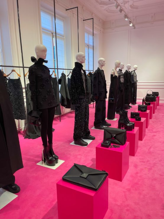
Dry pigment and synthetic resin on paper mounted on canvas 62 x 111 1/2 inch
Centre Georges Pompidou – Musée national d’art moderne, Paris, France
© The Estate of Yves Klein c/o ADAGP, Paris

«Blue has no dimensions, it is beyond dimensions, whereas the other colors are not. They are psychological spaces; red, for example, presupposing a hearth releasing heat. All colors bring forth specific associative ideas, tangible or psychological, while blue suggests, at most, the sea and sky, and they, after all, are in actual nature what is most abstract.» – Yves Klein, Lecture at la Sorbonne, June 3rd 1959, Paris

This artwork is showcasing the «true blue» pigment in perfection: the 17th-century painting The Virgin in Prayer by Giovanni Battista Salvi da Sassoferrato.

Another great example in the art world is by Dutch painter Johannes Vermeer. His famous work from 1665, Girl with a Pearl Earring,  shows classic blue as the only bold burst of colour – in the form of a headscarf – among beiges, browns and a dark background.

You might be asking yourself, how did PANTONE land on this color? The color authority looks at trend forecasts, fashion, beauty, lifestyle, political views, media, street art, travel destinations, new technologies, and new textures — to name just a few of the categories they consider. Then it’s time to narrow it down to a color family, in this case it was a blue mood, «a reassuring presence instilling calm, confidence and connection».

This enduring blue hue highlights our desire for a dependable and stable foundation on which to build as we cross the threshold into a new era.

Imprinted in our psyches as a restful color, PANTONE 19-4052 Classic Blue brings a sense of peace and tranquility to the human spirit, offering refuge. Aiding concentration and bringing laser like clarity, it re-centers our thoughts. A reflective blue tone, Classic Blue fosters resilience.

As technology continues to race ahead of the human ability to process it all, it is easy to understand why we gravitate to colors that are honest and offer the promise of protection. Non-aggressive and easily relatable, the trusted PANTONE 19-4052 Classic Blue lends itself to relaxed interaction. Associated with the return of another day, this universal favorite is comfortably embraced.

On the S/S 2020 runways, Classic Blue was omnipresent in all sorts of variations. As we all know, there is not «one» blue. In the 2006 film The Devil Wears Prada, Meryl Streep’s Miranda Priestly, gives a detailed speech about the varying shades of the colour blue, after Anne Hathaway’s Andy Sachs laughably questions how they could be distinguishable.

«… what you don’t know is that that sweater is not just blue, it’s not turquoise, it’s not lapis, it’s actually cerulean

This year marks the first time Pantone has introduced a multisensory approach to its Colour of the Year, partnering with several brands to showcase the taste, texture, scent and sound of Classic Blue.

Below you can shop some beautiful pieces in the Color of the Year 2020 –  time to get ahead of the fashion game. Just click on the highlighted text to be transferred directly.

LoL, Sandra

The Rockstud Spike medium quilted leather shoulder bag in Classic Blue by Valentino

icon
Two-tone patent-leather sandals in Classic Blue by Miu Miu


iconViola cropped embellished chiffon jacket by Jenny Packham

iconQuilted shell down jacket by Moncler

Intarsia wool cardigan by Gucci
icon

Photos: Courtesy of the Brands, Artists, and via NY Post

Greenery – Color of the Year 2017

greenery_color2017

In collage: Ruffle trimmed single breasted wool coat by Gucci and nail lacquer in Greenery by Butter London.

Each year PANTONE, the global color authority, chooses one Color of the Year, like a snapshot of what we see taking place in our global culture that serves as an expression of a mood and an attitude. For 2017, it is GREENERY, a refreshing and revitalizing shade, symbolic of new beginnings. This fresh and zesty yellow-green shade evokes the first days of spring when nature’s greens revive, restore and renew.

Illustrative of flourishing foliage and the lushness of the great outdoors, the fortifying attributes of Greenery signals consumers to take a deep breath, oxygenate and reinvigorate. Greenery is nature’s neutral. The more submerged people are in modern life, the greater their innate craving to immerse themselves in the physical beauty and inherent unity of the natural world.

trendss2017_greenery
Michael Kors – Loewe – Emilio Pucci

Designers’ love of geekiness dictated an unexpected new power color on the S/S 2017 runways, making that vibrant shade a real showstopper. A life-affirming hue, Greenery is also emblematic of the pursuit of personal passions and vitality. See below in my post some of the best pieces to utilise greenery from now.

And while you are shopping, prepare yourself a trendy Matcha tea to get you in the ultimate Greenery mood!

LoL, Sandra

mulberry_bag_greenDarley textured-leather shoulder bag by Mulberry

prada_greeneryWatermelon printed bag by Prada

earrings_delarentaGold-tone, resin and Swarovski crystal earrings by Oscar De La Renta

803180_in_xlFaux pearl-embellished wool-crepe mini skirt by Gucci

balenciaga_bag_suedeClassic Metallic Edge City mini suede shoulder bag by Balenciaga

Photos: Courtesy of Pantone and the Brands

Marsala – Colour of the Year 2015

Marsala Year 2015

Every year, I am curious which shade will be announced by global color authority Pantone as the official color of the year. For 2015, it is a soothing and comforting tone, which could be an inspiration for a balanced and more fulfilling life: MARSALA. Much like the fortified wine that gives it its name, this tasteful hue with its grounding red-brown roots embodies a satisfying richness and a sophisticated, natural earthiness.

A hearty yet stylish tone, the impactful, full-bodied qualities of Marsala make for an elegant, grounded statement color when used on its own or as a strong accent to many other colors. I like it extremely in combination with mint green. It’s time to fill your wardrobe with the new It-shade!

Kiki de Montparnasse

Leather bustiericon by Kiki de Montparnasse


Valentino Marsala

Fringed suede trench coaticon by Valentino

Smythson Marsala

Textured-leather travel walleticon by Smythson

Marsala, a slightly muted wine shade. It’s much deeper and more winter-friendly than last year’s bright, showy purple, Radiant Orchid, which means it’s kind of perfect to start wearing right now. If you’re into it, here are a some great beauty products in the hue:

Chanel Exception 639 Nail Polish

Marsala for Nails: Chanel‘s Le Vernis in “639 Exception“, CHF 35.00

By Terry MarsalaBaume De Rose Nutri-Couleur – Bloom Berry iconby By Terry

YSL Kiss & Blush Babydoll Marsala

Baby Doll Kiss & Blush Lips & Cheeks in 11 Prune Impertinente iconby Yves Saint Laurent

Dior 876 Trafalgar -Marsala

5-Colour Eyeshadow in 876 Trafalgar iconby Christian Dior

This post is available in German and French on the Marionnaud blog. Check it out – there are more interesting products available.

LoL, Sandra

Photos: Via Pantone, Etsy, Valspar Reserve, pica4u.ru – Stills: Courtesy of the Brands

Colour of 2014: Radiant Orchid

Pantone-Radiant Orchid

Global color authority Pantone announced its official shade for 2014: RADIANT ORCHID, a captivating and enigmatic purple! “While the 2013 color of the year Emerald, served as a symbol of growth, renewal and prosperity, Radiant Orchid reaches across the color wheel to intrigue the eye and spark the imagination,” said Leatrice Eiseman, Executive Director of the Pantone Color Institute®.

Feeling inspired? Shop the trending colour to your wardrobe with my picks:

Radiant Orchid 2014 Mode

Inner Strength Bath & Shower Oil iconby Aromatherapy Associates
Studded wool sweater by Versace
18-karat gold amethyst ring by Pippa Small icon
4 Queen Vic – Nail Polish by Butter Londonicon
Polished-leather and satin pumps iconby Lanvin

Radiant Orchid’s rosy undertones radiate on the skin, producing a healthy glow when worn by both men and women. A dazzling attention-getter!

Nouveau Fringe Bag

My favourite accessory: Nouveau suede fringe shoulder bag iconby Gucci.

LoL, Sandra

The Colour of the Year is Emerald

Trend_Summer2013_Emerald

“Lively. Radiant. Lush… A colour of elegance and beauty that enhances our sense of well-being, balance and harmony.”

Ladies and Gentlemen, drum roll please, it is official, EMERALD GREEN is the colour of the year according to Pantone, the authority and market leader in colour. One of the season’s hottest fashion trends, the timeless shade was seen on many S/S 2013 runways such as Gucci (my favorite), Kenzo and Burberry Prorsum (combined with another trend: metallics).

ICE-Watch_EmeraldICE Watch has launched a new unisex watch model in collaboration with Pantone dedicated to the trendy emerald tone, in two variants: emerald and white/white and emerald. 
Other trend colours will follow in the future.
ICE Watch Emerald White – CHF 109.00

From fashion to beauty, there are many ways to wear this vibrant colour from day to night and it’s a definite go-to for your next shopping trip!

Gucci_SS2013_look_emerald

Belted silk-twill blouse and matching silk-twill flared pants, both by Guccisuede platform pumps iconby Giuseppe Zanotti and Lulu leather shoulder bag iconby Saint Laurent.

Don’t forget to look for some gorgeous makeup products that will complement your new season look, now may be the best time.

Nails_Turquoise

A great way to get started with the new style are nail polish shades in sea hues. Draw attention to your manicure and you will be really hitting the trend.

The best ones available are: CHANEL Le Vernis in 657 Azuré and 667 Bel Argus (CHF 35.00 each), DIOR Vernis Bird of Paradise Duo 001 Samba (One Shot, CHF 47.00) and YVES SAINT LAURENT La Laque Couture 36 Vert D’Orient (CHF 38.00).

The nail polish shades are part of my two favourite summer beauty looks by DIOR and CHANEL. Have a look yourself how beautiful those collections inspired by enchanting animals are:

Dior_Birds_of_paradise-Look

DIOR – Bird of Paradise

Inspired by Christian Dior‘s passion for color, the new collection tells the tale of an exotic faraway. Drawing from nature’s tropical paradises, the Bird of Paradise collection embraces the vibrancy of nature and translates to versatile, wearable shades for summer.
In stores now.

My personal must-haves:

Dior_Eyeshadows

DIOR 5 Coleurs Eye Shadow 374 Blue Lagoon (One Shot, CHF 92.00)
The legendary 5 Couleurs case is coated with shimmering pigments, inspired by the golden reflections of a peacock’s feathers. Stunning!

Diorshow_Eyeliner_Emerald

DIOR Diorshow Liner Waterproof Aqua Green (One Shot, CHF 34.00)
Add a fun pop of color to your eye makeup with this limited edition liner.


Chanel_l'ete_Papillon

L’Eté de Papillon de CHANEL

Another amazing collection comes from the house of Chanel. Creative Director of Makeup Peter Philips was inspired by the dazzling colours of butterfly wings and created electric shades for the eyes. A stunning effect is achieved is through the application of colorful mascaras.
Available in Switzerland starting end of May 2013.

My personal must-haves:

Chanel_Stylo_Eyeshadow

CHANEL Stylo Eyeshadow 47 Blue Bay (CHF 47.00)
This exclusive creation is easily applied to highlight eyes with gleaming colour. The smooth-gliding pen has a cooling, water-infused formula for a shimmering veil on lids or precise definition.

Chanel_Mascara_Emerald

CHANEL Mascara Inimitable Waterproof 37 Lime Light (CHF 47.00)
The iconic mascara in a long-wearing, waterproof formula that won’t flake or smudge comes this season vibrant limited edition shades of blue, green and yellow.

To complement such a vibrant beautiful eye makeup, choose lips in orange, apricot huesfollowing in the footsteps of Tangerine Tango, which was the shade of 2012
Stay tuned for an upcoming post in which I am wearing this beauty look.

LoL, Sandra

Photos: Courtesy of Chanel, Dior, Ice Watch, Style.com and © Sandra Bauknecht